As the design and brand director of BottleRock Napa Valley's 2013 and 2014 festivals, I established and created the BottleRock brand look and feel. I then lead my team at Plumbline Creative as we implemented any and all brand-related elements across every form of media and on practically every conceivable surface. Every sign, every t-shirt, everywhere you looked you saw the BottleRock Brand. Industry insiders remarked that for a first-year festival, it sure didn't look like one.
Thank you to the many photographers and Latitude38 Entertainment for the use of many of these photos. Bob Mclenahan, Dona Bonick, Mitch Glotzer, Paige Parsons and Sandi. If you would see a shot here that you need me to credit, please let me know.
MERCH
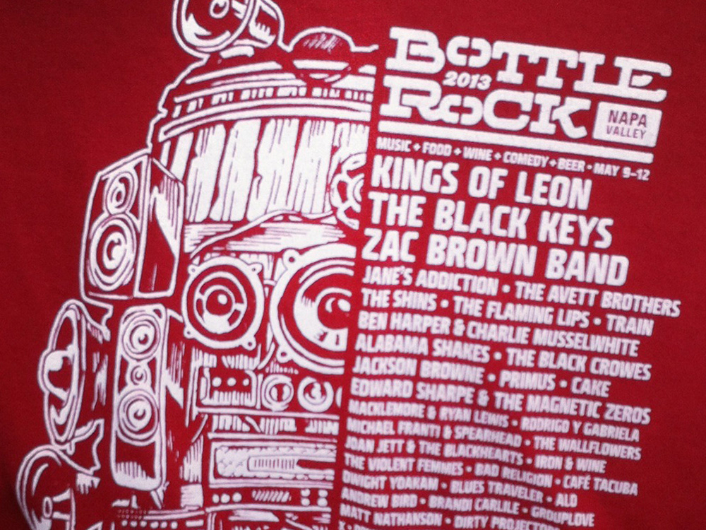
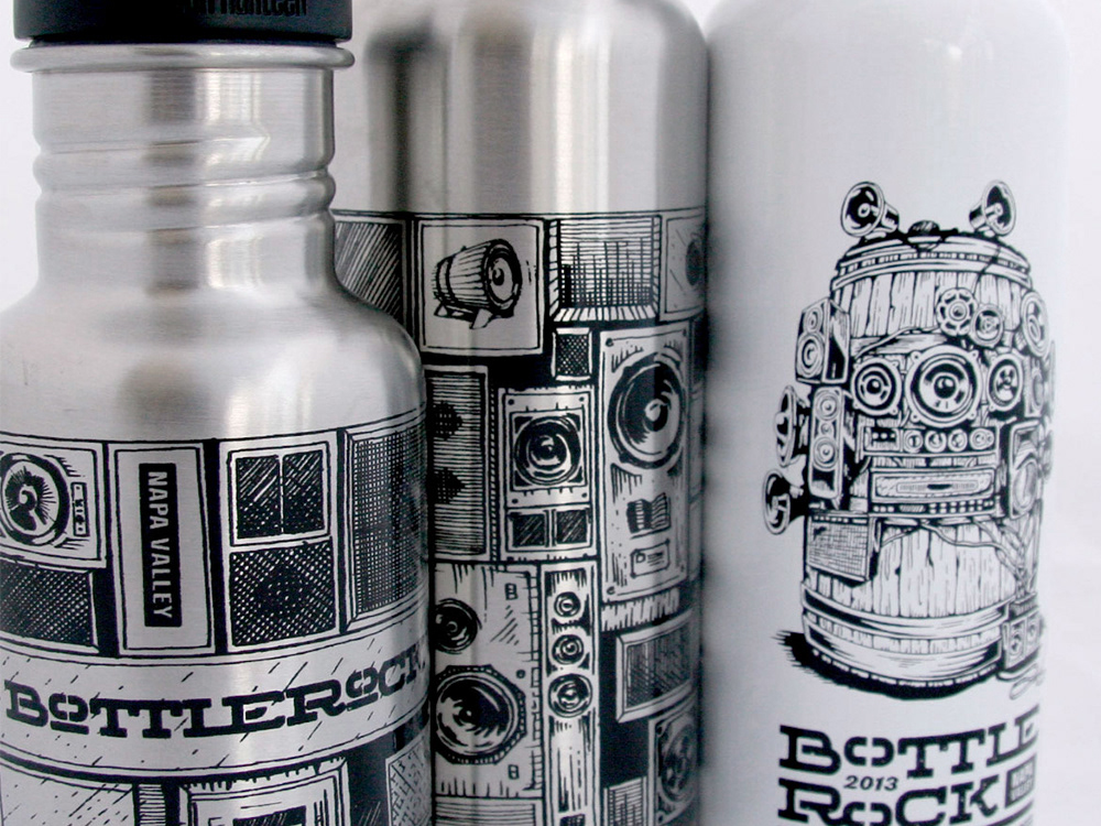
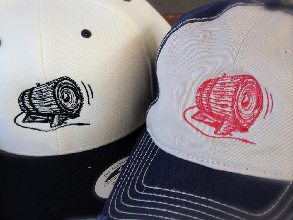
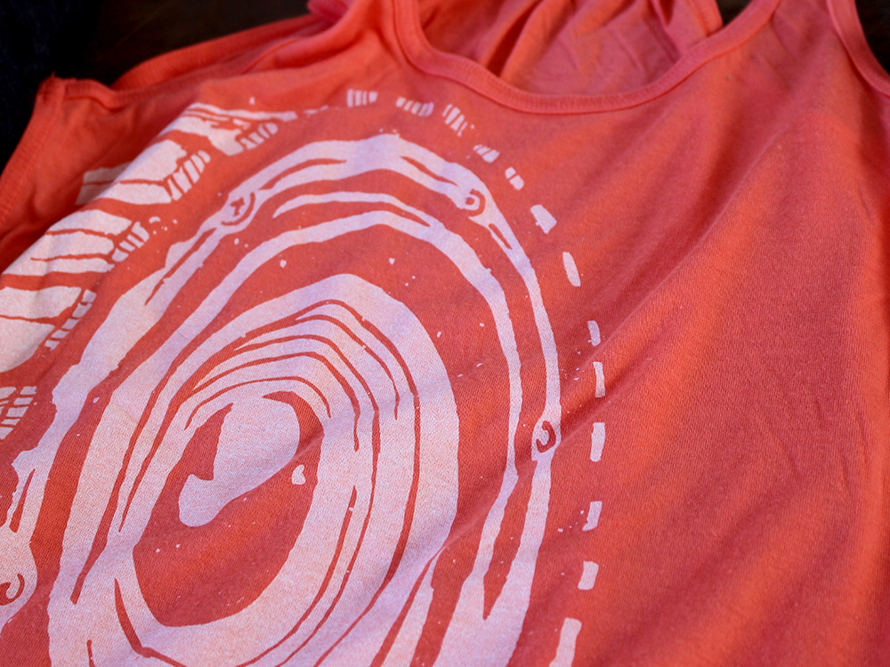
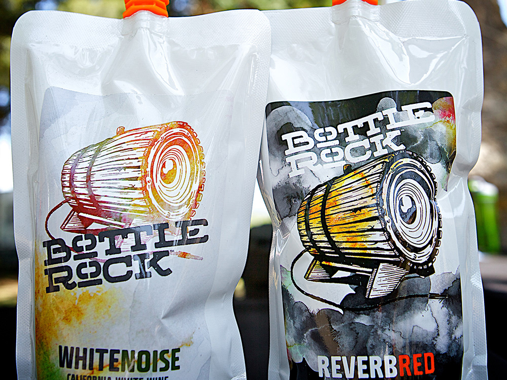
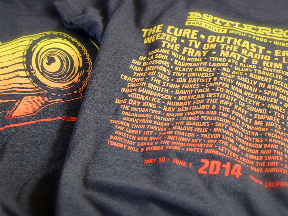
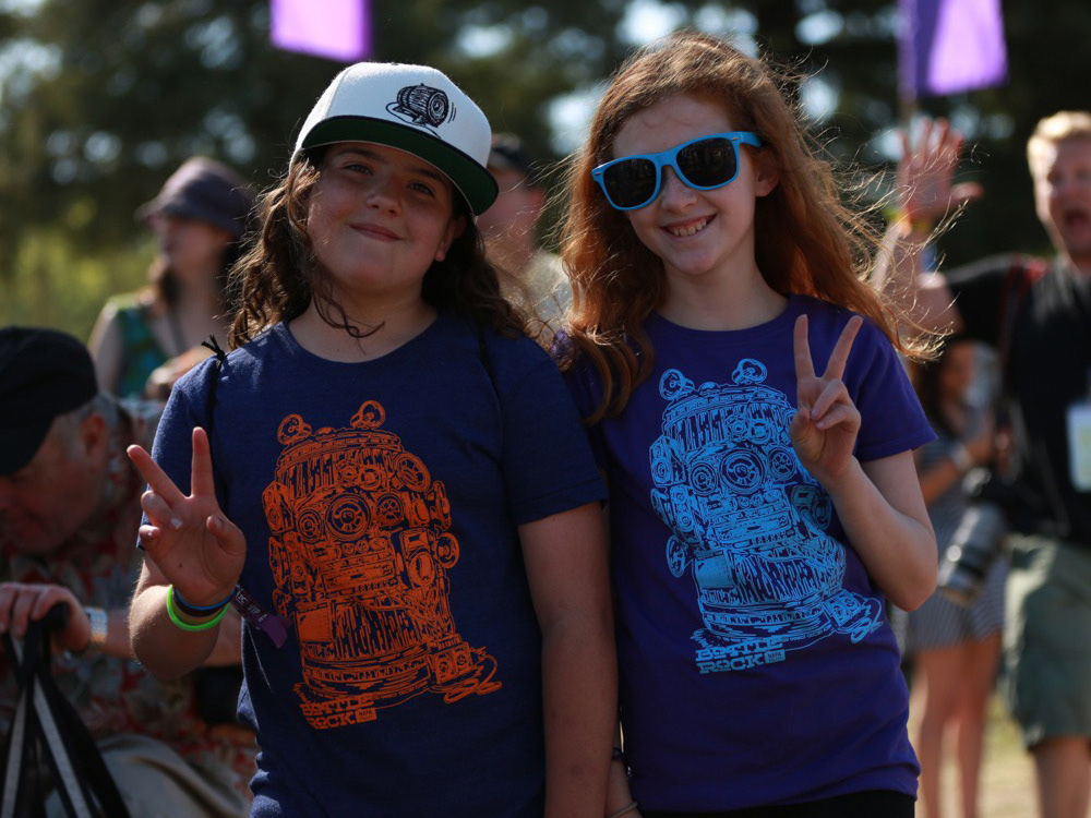
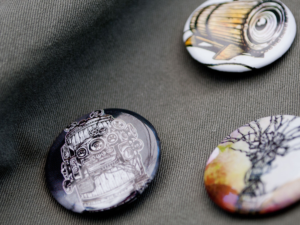
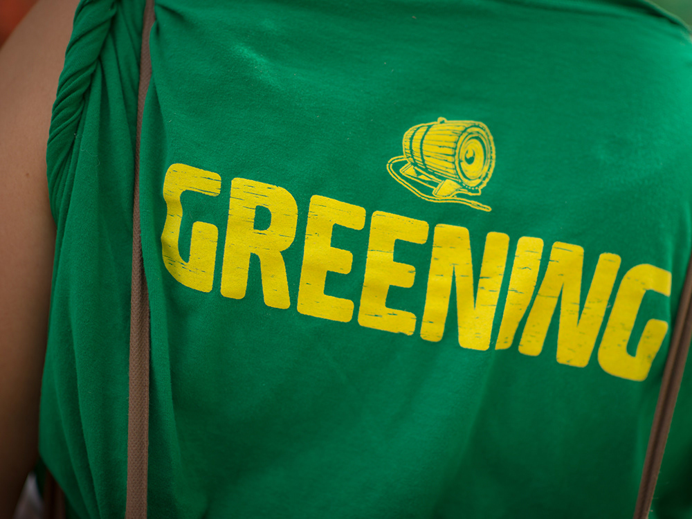
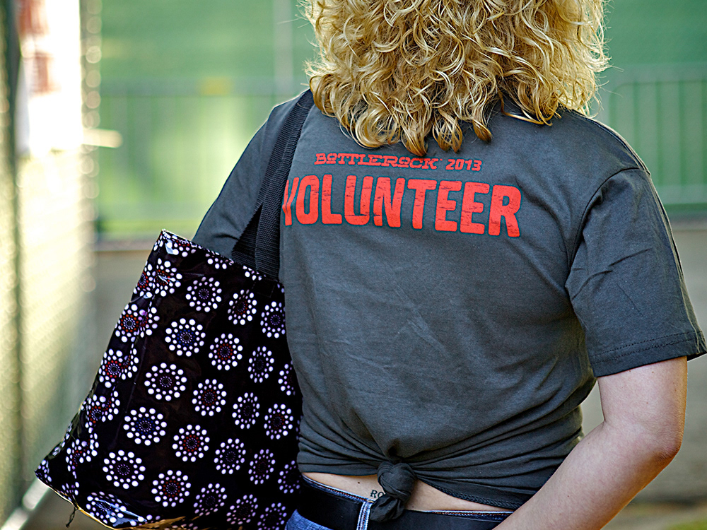
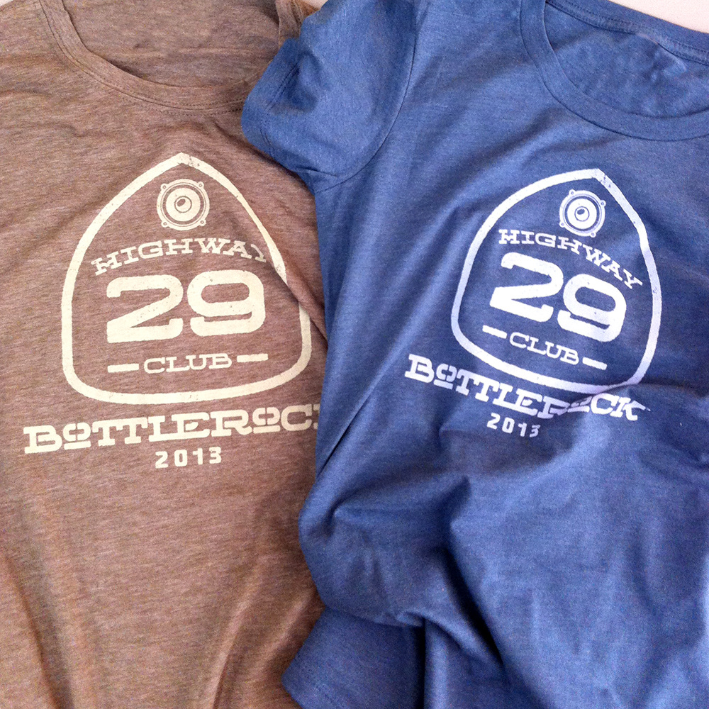
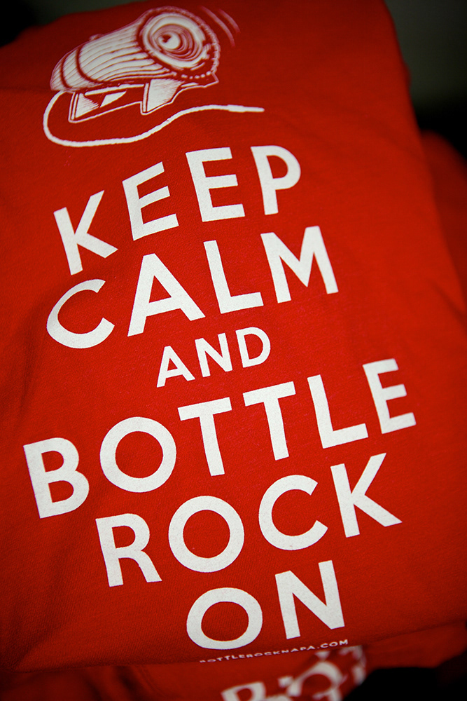
Literally tons of merchandise carried the brand look and feel. Waterbottles, guitar picks, stickers, tee, hoodies, jackets, buttons, posters... Tio this day we see Napa locals rockin' their BottleRock Gear.
PROMOTION
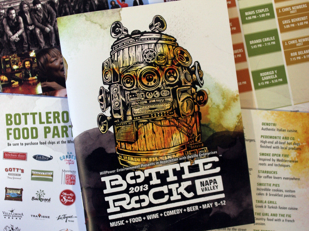
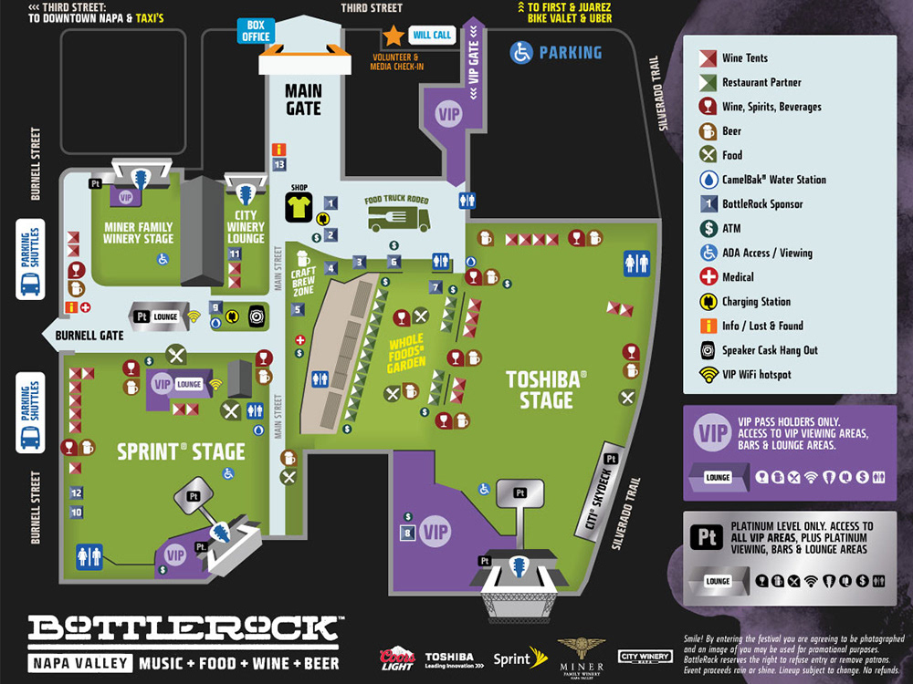
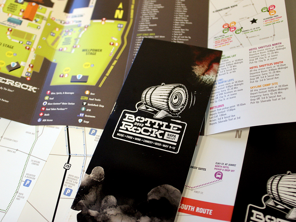
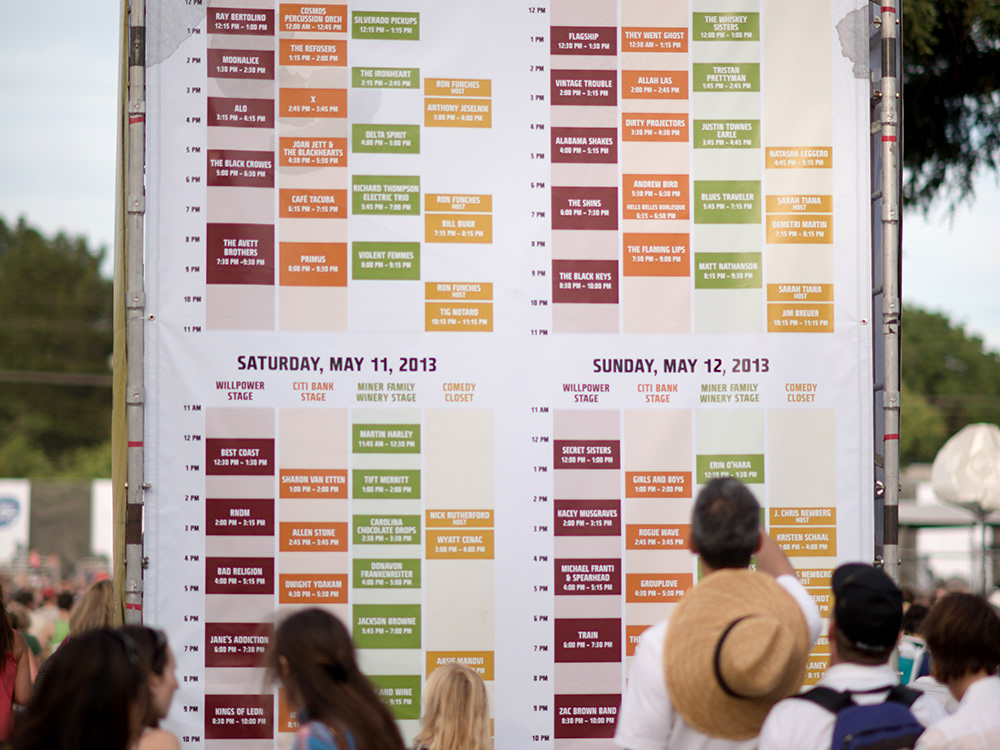
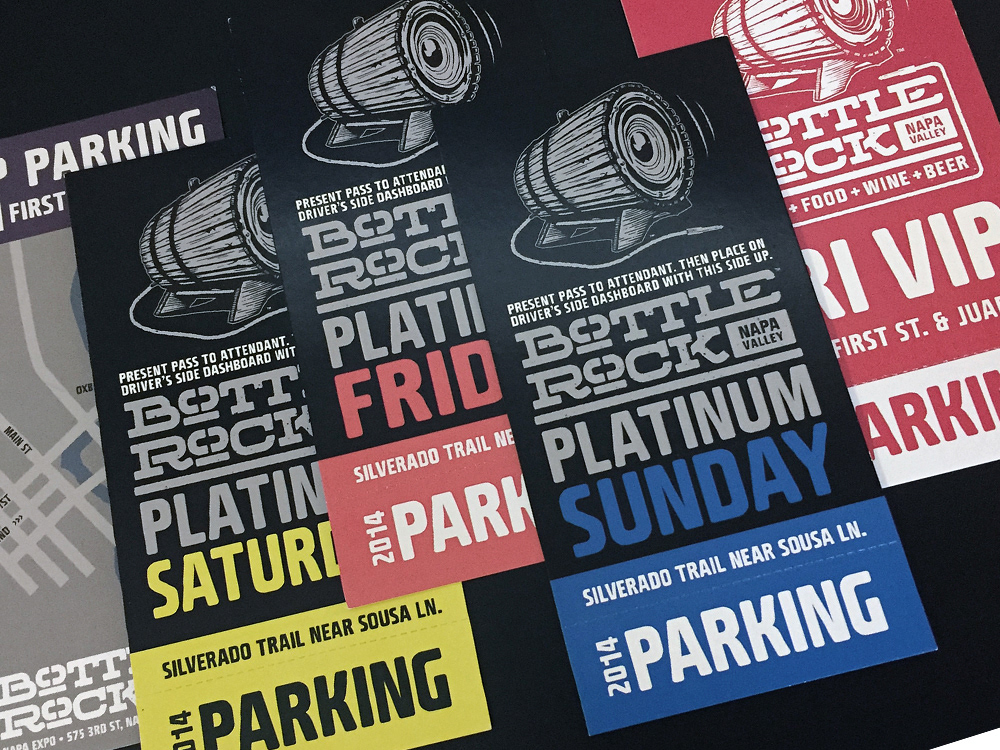
Advertising and print promotion including thousands of flyers and posters, plus festival maps, parking, transportation, and general guest information.
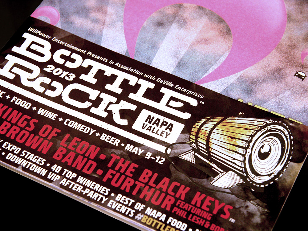
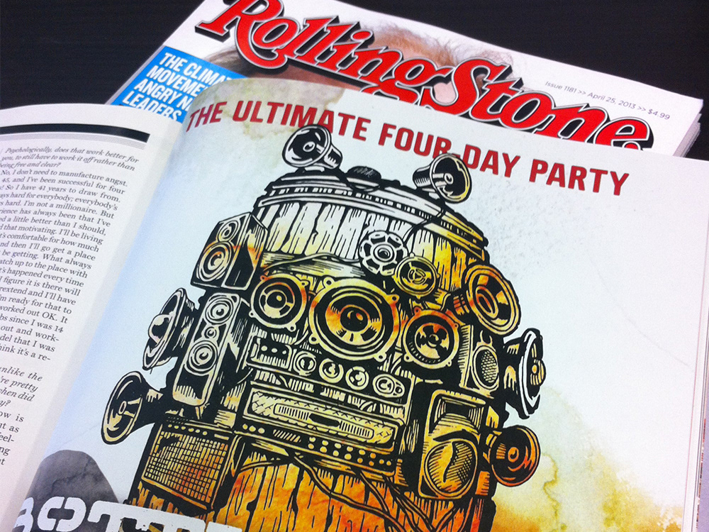
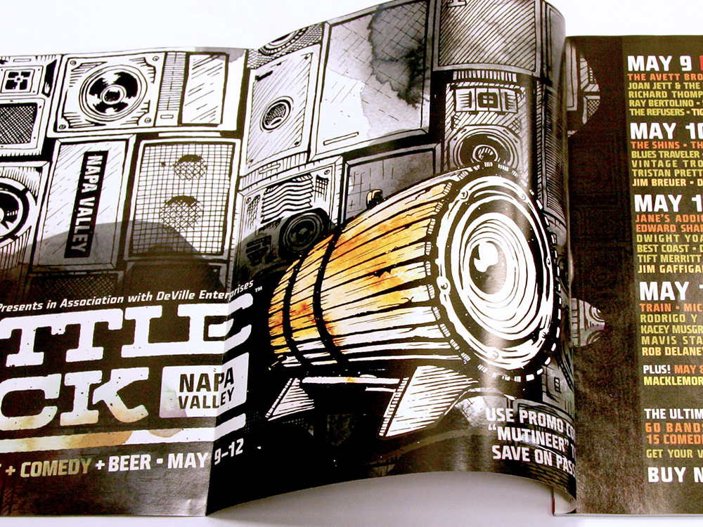
ENVIRONMENT
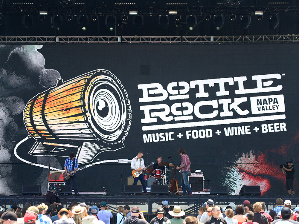
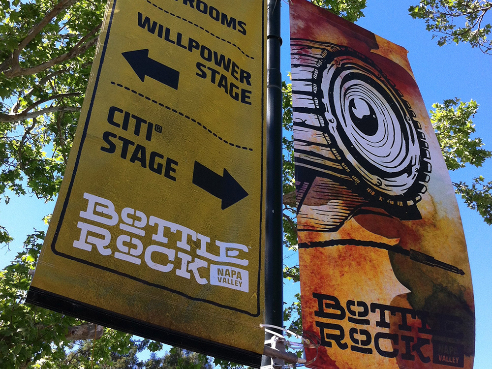
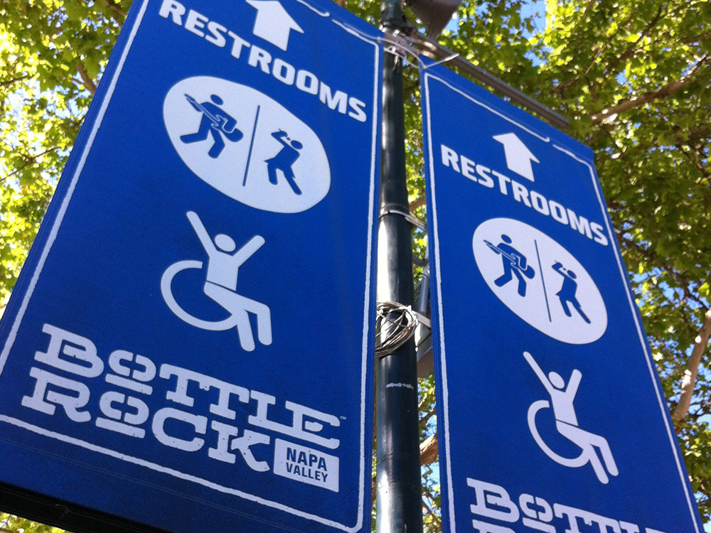
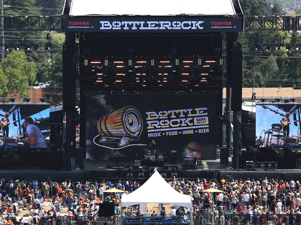
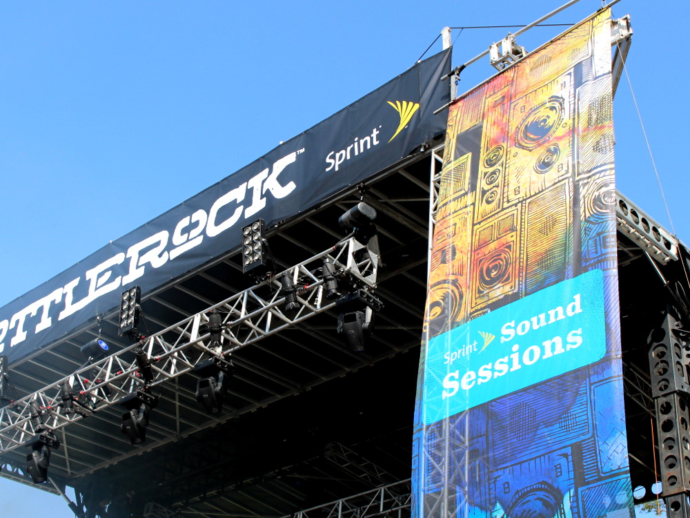
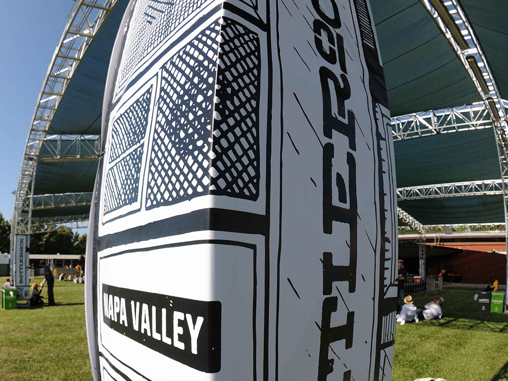
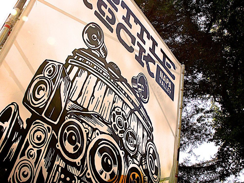
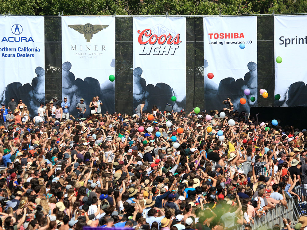
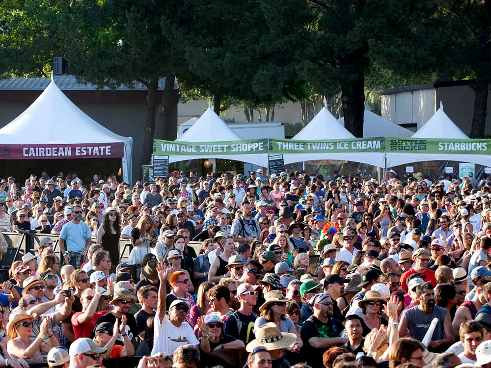
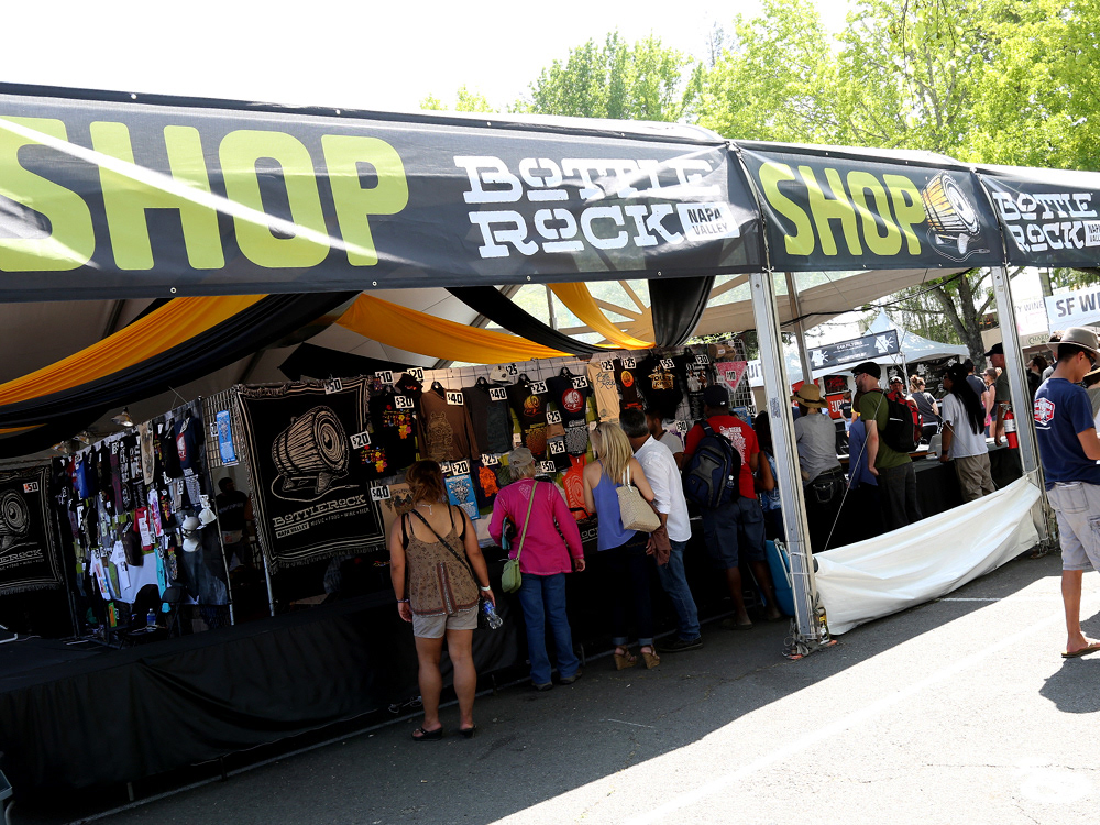
For the 5 days in 2013 and the 3 days in 2014, our goal was to saturate the environment with the BottleRock brand. Stage graphics, vertical banners, signs, fence coverings, tent headers, and other super graphics literally surrounded the festival grounds.
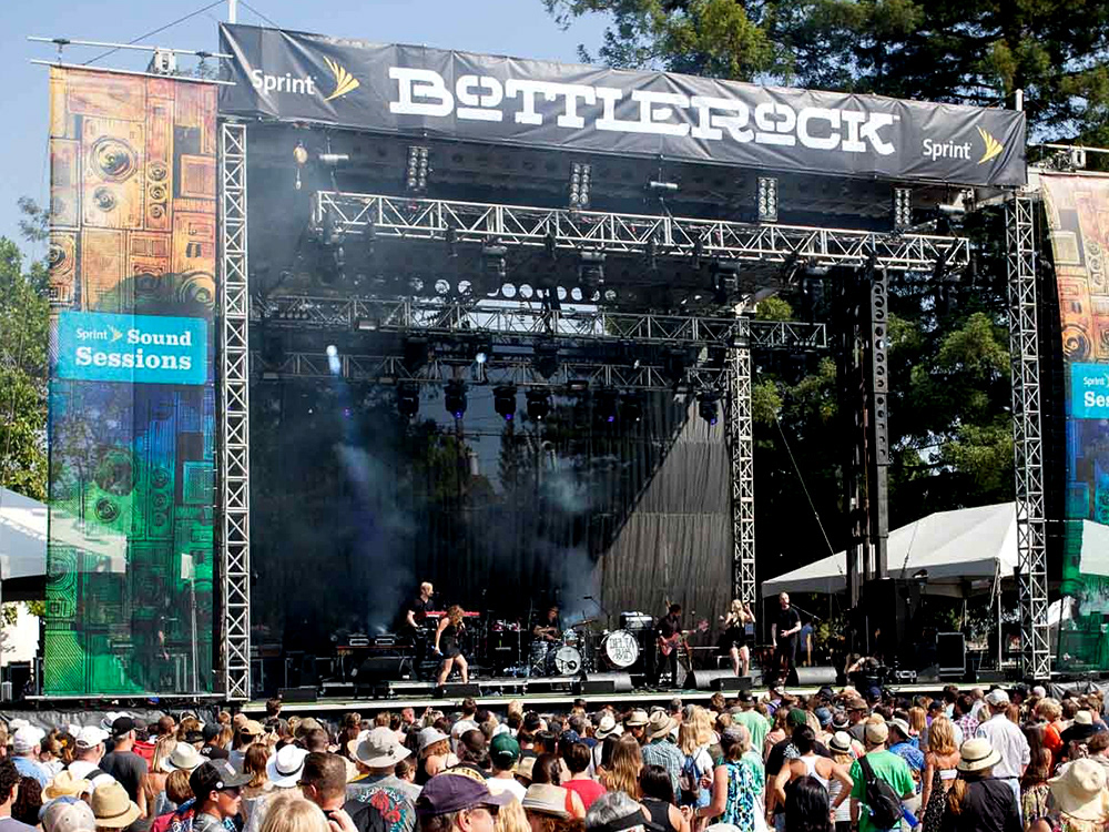

EVERYTHING ELSE
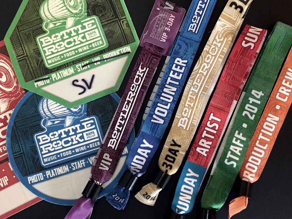
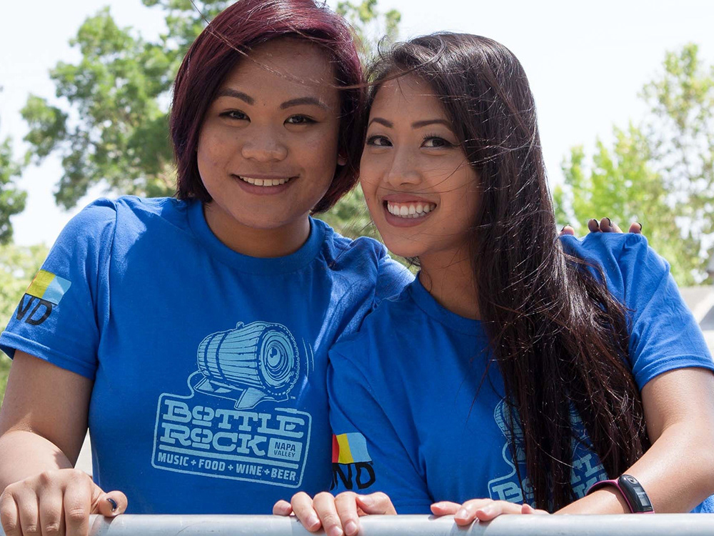
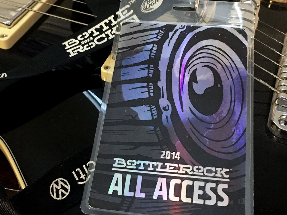
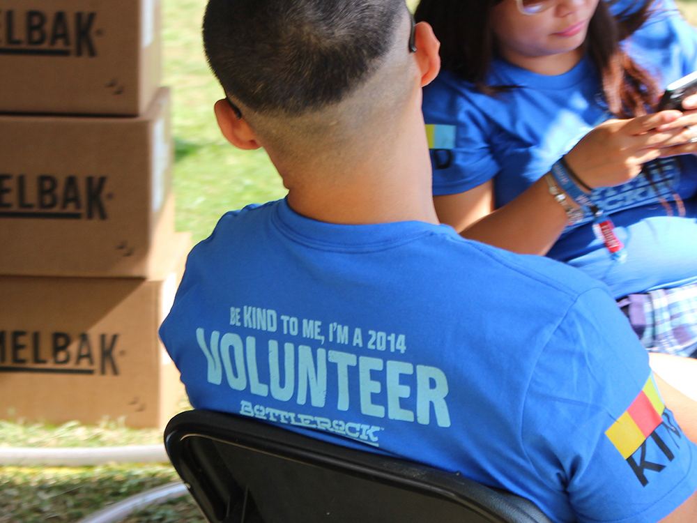
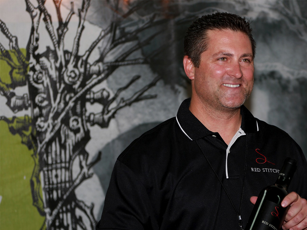
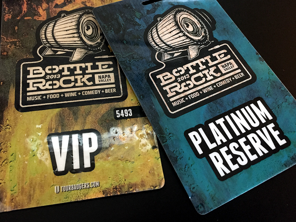
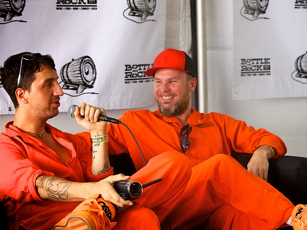
The amount of "things" we created in just a few months in 2013 and 2014 is almost unbelievable. We faithfully (and very very quickly) extended and applied the BottleRock Brand to media backdrops, special event promotion, sponsor activations, staff and volunteer identification, passes, tickets, digital media, and on and on.
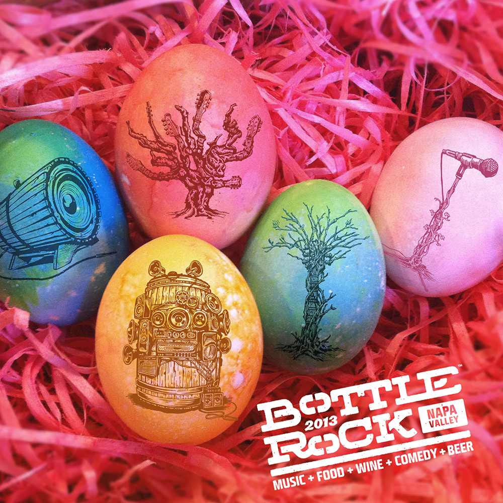
To say it was epic would be an outrageous understatement. We created and them implemented an entire festival brand system successfully in less than five months. And then did it again the following year. We established a foundation for the BottleRock brand that greatly contributed to the festival's continued growth and success. And it was the most satisfying and incredible creative experience I have ever had.
